Block Side Menu
The Block Side Menu appears on the left side whenever you hover a block. By default, it consists of a + button and a drag handle (⠿):


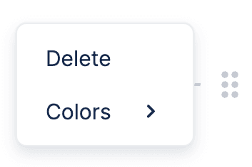
Clicking the drag handle (⠿) in the Block Side Menu opens the Drag Handle Menu:

Changing the Block Side Menu
You can change or replace the Block Side Menu with your own React component. In the demo below, the button to add a new block is replaced with one to remove the hovered block.
We first define our custom RemoveBlockButton. The useComponentsContext hook gets all components used internally by BlockNote, so we want to use Components.SideMenu.Button for this.
We use the SideMenu component to create a custom Block Side Menu. By specifying its children, we can replace the default buttons in the menu with our own.
This custom Side Menu is passed to a SideMenuController, which controls its position and visibility (on the left side when you hover a block).
Setting sideMenu={false} on BlockNoteView tells BlockNote not to show the default Block Side Menu.
Changing Drag Handle Menu Items
You can also change the items in the Drag Handle Menu. The demo below adds an item that resets the block type to a paragraph.
Here, we use the SideMenu component but keep the default buttons (we don't pass any children). Instead, we pass our customized Drag Handle Menu using the dragHandleMenu prop.
File Panel
The File Panel appears whenever you select an image that doesn't have a URL, or when you click the "Replace File" button in the Formatting Panel when an image is selected.
Suggestion Menus
Suggestion Menus appear when the user enters a trigger character, and text after the character is used to filter the menu items.